Cursive tattoo fonts that stay readable
A cursive tattoo font is the most requested and the most fragile choice in lettering, because the thin connecting strokes that make it pretty are the first ones to close.
- Cursive joins letters, so the thin stroke between two letters is the weakest mark in the whole word.
- Lowercase loop letters need roughly 8 mm of body height to keep their enclosed spaces open for decades.
- Below 5 mm of letter height no cursive holds, and block or roman capitals are the only honest options.
- A 0.5 mm hairline typically reads as a full millimeter within five to ten years.
- Fingers, hands and feet blur fastest, so cursive in those spots often needs a touch up inside five years.
- Minimum letter height8 mm for lowercase loops
- Thinnest safe strokeAbout 0.8 mm, 3RL
- Typical phrase size8 to 20 cm (3 to 8 in)
- Studio cost$150 to $600 a phrase

Cursive joins every letter to the next, so the shape of a word depends on strokes that carry no weight at all. On paper that contrast is the whole appeal. In skin, ink keeps migrating sideways in the dermis for the life of the tattoo, and the first thing to disappear is the gap where a thin upstroke meets a thick downstroke.
The number that decides whether your cursive survives is letter height, measured on the body of a lowercase letter, not the overall length of the phrase. A 20 cm phrase set in 4 mm letters is a worse bet than a 7 cm phrase set in 10 mm letters. Measure the letters, then decide how many words you can afford.
Why cursive closes up, and the heights that hold
Ink spread closes counters first. The counter is the enclosed white space inside an a, an e, an o or the bowl of a g, and in cursive those spaces are already small because the pen is moving fast through them. Every stroke widens by a fraction of a millimeter per decade, so a counter that measured 1 mm on the stencil is a dark dot by year twelve and the letter reads as an n or an undifferentiated lump.
The second failure is the join. Where a hairline upstroke leaves one letter and meets the thick entry of the next, two spreading strokes grow towards each other. Once they touch, the word turns into a dark ribbon with a recognizable outline and no letters inside it. Set your own words at each size in the preview at /tools/tattoo-font-generator/ before you commit to a height.
| Letter height | What holds | What fails |
|---|---|---|
| Under 5 mm | Block, stencil and roman capitals | Any cursive or script hand |
| 5 to 7 mm | Clean sans and plain serif | Cursive hairlines and tight loops |
| 8 to 12 mm | Most cursive and script hands | Extreme copperplate contrast |
| Above 12 mm | Everything, including high contrast | Nothing, if the spacing is generous |
Cursive handwriting for tattoos
Tracing a real person's hand is the most personal lettering tattoo and the most technically awkward. A note, a card or a signature carries pen pressure that no font reproduces, and it also carries dry ballpoint skips, a shaky line and strokes under 0.3 mm. An artist has to rebuild all of that at a width a needle can actually lay down, which means thickening everything and smoothing the wobble.
Give the artist the best source you can find and let them letter it rather than importing the scan straight into a stencil. The name tool at /tools/name-tattoo-generator/ is useful for seeing how a specific name sits as a cursive word before you book.
Getting someone's handwriting into a usable stencil
- Scan the original at 600 dpi or higher instead of photographing it under a lamp
- Pick a sample written with a pen that laid an even line, not a dry ballpoint
- Ask for every stroke to be brought up to at least 0.8 mm
- Accept that a bad wobble will be smoothed, because on skin it reads as a mistake
- Keep the words short, since a full sentence in someone's hand needs 20 cm or more
Tattoo cursive letters and fonts, family by family
Monoline cursive has one stroke weight throughout, which is why it survives small. There is no hairline to lose, so the whole word thickens evenly and stays readable at 7 or 8 mm. It looks plainer than a shaded script, and that plainness is what buys you fifteen years.
Shaded cursive, the kind with a visible thick to thin rhythm, needs 10 mm and up. Sailor script, the round looping hand on American traditional banners, was drawn by tattooers for skin: even weight, wide spacing, no hairlines, and it holds at 6 mm. Copperplate style cursive with a true hairline upstroke wants 12 mm minimum, and even then the artist usually exaggerates the thick strokes rather than thinning the thin ones.
Baseline, spacing and the last check
A forearm, a ribcage and a wrist are all curved surfaces, so a straight line of cursive pasted onto them reads crooked from most angles. The baseline has to be drawn on the body in stencil pen and adjusted while you stand in a natural posture. A font dropped into a stencil kerns badly on a curve: the letters keep their flat spacing and the word fans out at one end.
Ask for wider letter spacing than looks right on the screen, because every stroke grows outward. Then read the words backwards, letter by letter, out loud, with one other person holding the original text. That is the only method that reliably catches an autocorrect substitution, a doubled letter or a straight apostrophe where a curly one belongs.
12 lettering designs, with the prompt behind each one
Every design below came out of AI Tattoo Lab. Tap one to load its prompt into the generator, then change a word and make it yours.

The word breathe in a delicate hairline cursive script
Use this prompt
The word amor in a heavy formal cursive with thick downstrokes
Use this prompt
The phrase stay true in a bold brush cursive script
Use this prompt
The word fearless in a slanted copperplate cursive script
Use this prompt
The phrase hold on in a rounded upright cursive script
Use this prompt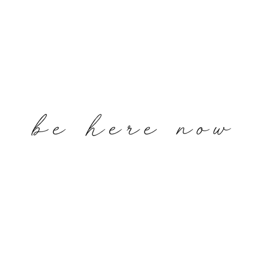
The phrase be here now in a light airy spaced cursive
Use this prompt
The word grace in ornate Spencerian cursive with looping flourishes
Use this prompt
The phrase my love in a whisper thin single needle script
Use this prompt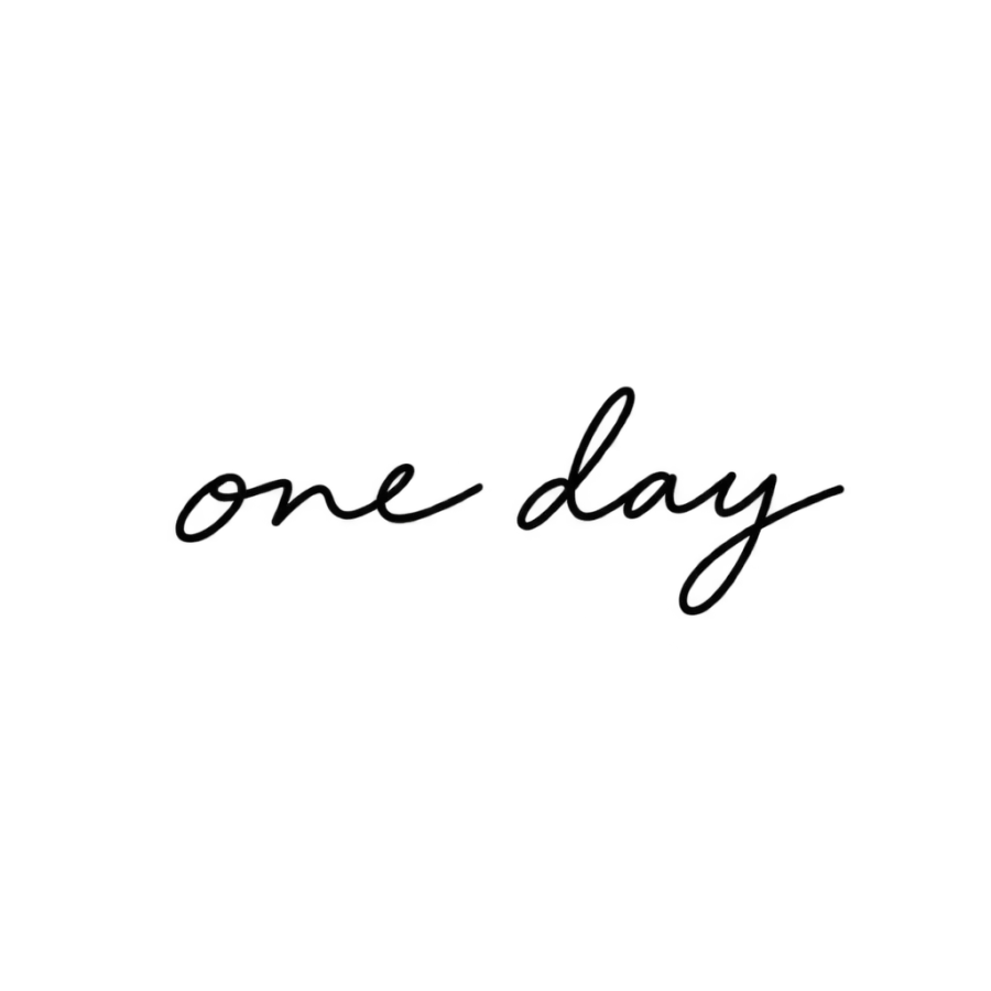
The phrase one day in a casual handwritten cursive
Use this prompt
The word courage in a strong formal shaded cursive
Use this prompt
The phrase keep going in sweeping cursive with an underline
Use this promptDescribe an idea of your own and get four designs back in about 20 seconds.
Open the generator
Questions people ask
What is the best cursive tattoo font?
Monoline cursive, because it has one stroke weight and nothing thin to lose as the ink spreads. Sailor script is the other safe pick, since tattooers drew it for skin rather than paper. Shaded and copperplate style cursive both look better on the stencil and age worse.
How small can cursive tattoo letters be?
Lowercase cursive needs about 8 mm of body height, and 10 mm if the hand has thick and thin strokes. Below 5 mm nothing cursive holds, and the only options that stay legible are block or roman capitals. Measure the letters rather than the length of the phrase.
Can I use cursive handwriting for tattoos?
Yes, and it is worth doing well. Scan the original at 600 dpi or better, pick a sample written with an even pen, and expect the artist to thicken every stroke to at least 0.8 mm. A traced scan dropped straight into a stencil usually has lines too thin for a needle to hold.
Do cursive tattoos blur over time?
They spread rather than blur. Each stroke widens slightly for the life of the tattoo, so the enclosed spaces inside a, e, o and g close first and the joins between letters fill in next. Generous letter spacing and 10 mm letters slow it down. Fingers, hands and feet go fastest.
Should every letter be joined in a cursive tattoo?
Not necessarily. Many lettering artists break the joins on purpose at small sizes, so each letter keeps its own white space and the word stays readable once the ink settles. The look is slightly less flowing and the tattoo lasts considerably longer. Ask for the version drawn at your actual size.