Script tattoo fonts and lettering that last
A script tattoo looks effortless on a screen and takes more drawing skill than almost anything else on skin, because every join has to be judged by eye.
- Minimum letter height8 to 10 mm for script
- Needle for the line3RL, sometimes 5RL
- Typical phrase size10 to 25 cm (4 to 10 in)
- Studio cost$200 to $800 a phrase

Script covers any hand where the letters flow and the strokes change weight, from an engraved copperplate to a fat brush gesture. The family you pick sets the smallest letter height you can get away with, and that height then sets how many words fit the spot. Most people choose the words first and discover the size problem in the chair.
The other thing script decides is who should tattoo it. Shading a rose forgives a wobble. A script letter does not, because anyone who reads English can see that the o is lopsided. The best lettering artists do almost nothing else, and booking one is the single biggest improvement you can make to a script tattoo.
Script font styles for tattoos
Five families cover nearly every script tattoo booked. They differ mainly in stroke contrast, which is the ratio between the thickest and thinnest part of a letter. High contrast is what makes a script look expensive and what makes it close up, because the thin part spreads into the gap beside it.
Compare them at your own wording in the preview at /tools/tattoo-font-generator/, or set a name at /tools/name-tattoo-generator/, at the size you actually want rather than full screen. A script that reads beautifully at 400 pixels tall is a solid shape at 9 mm.
| Script hand | Stroke contrast | Smallest letter height | How it ages |
|---|---|---|---|
| Sailor script | Even weight | 6 mm | Holds for decades |
| Modern monoline | None | 7 mm | Thickens evenly |
| Brush script | Moderate | 9 mm | Fine if the gaps stay open |
| Spencerian | Light shading | 10 mm | Softens, stays readable |
| Copperplate | Extreme | 12 mm | Hairline upstrokes close first |
Tattoo script lettering fonts versus a hand drawn word
A printed font has one set of letter shapes and one set of spacing values, worked out for a flat page. A letterer draws the words for the body part, so the baseline bends with the limb, the ascenders miss each other, and the space between a capital and the letter after it is set by eye rather than by a table in a font file.
The difference shows up worst on a curve. Paste a script font into a stencil, wrap it around a forearm, and the letters hold their flat spacing while the word fans open at the top and crowds at the bottom. Bring the font as a reference for the family you like, then let the artist redraw it.
What a letterer does that a font cannot
- Bends the baseline to the limb and checks it in your natural standing posture
- Widens the space after a capital and after any letter with an open tail
- Changes the shape of a repeated letter so two of them do not sit identically side by side
- Thickens anything under 0.8 mm so a 3RL can actually lay it
- Breaks a join where two spreading strokes would meet within ten years
The baseline a script needs on each spot
Down the outer forearm the baseline runs along the bone and reads from the elbow towards the wrist, which means it is upside down to everyone looking at you. Along the inner forearm it reads the right way round for the wearer. Across a ribcage the text has to follow the rib line, which is a shallow arc that steepens as it goes back, so the drawing is done on the body and nowhere else.
A collarbone script follows a double curve and usually has to shorten by a word or two to stay inside the bone. Around a wrist the line disappears from view every few centimeters, so short words and a clear start point matter more than the font. Fingers, hands and feet take the most friction and the most sun, and script in those places blurs faster than anywhere on the body.
Cost, sessions and how script holds up
A four to six word phrase at 15 cm takes one to two hours and runs $200 to $500 at most studios, more with a lettering specialist who has a waitlist. A large chest or back script with flourishes reaches $600 to $1,500. Lettering is cheap in ink and expensive in drawing time, and the drawing is what you are paying for.
Ten years in, a well drawn script at 10 mm letter height looks slightly heavier and still reads. The same words at 5 mm are a dark line. If your spot cannot fit the words at a safe height, the honest fix is fewer words, not a smaller font.
12 lettering designs, with the prompt behind each one
Every design below came out of AI Tattoo Lab. Tap one to load its prompt into the generator, then change a word and make it yours.

The word always in delicate fine line script
Use this prompt
The word amor in a heavy formal script
Use this prompt
The words stay true in sailor script with a swash underline
Use this prompt
The word fearless in a modern brush script
Use this prompt
The words hold on in a tight slanted script
Use this prompt
The phrase be here now in light script on three lines
Use this prompt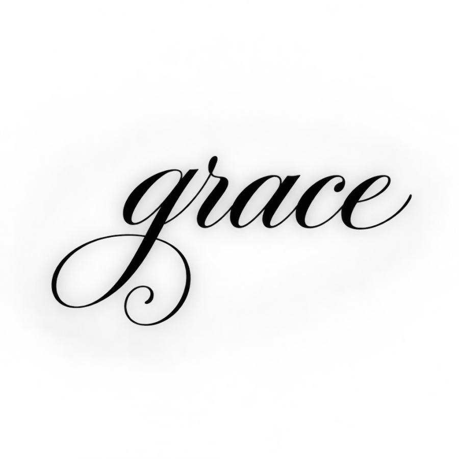
The word grace in copperplate script with a spiral flourish
Use this prompt
The words my love in a soft rounded looping script
Use this prompt
The words one day in a monoline script, even thin weight
Use this prompt
The word courage in a bold condensed script
Use this prompt
The words keep going in flowing script on a rising curve
Use this promptDescribe an idea of your own and get four designs back in about 20 seconds.
Open the generator
Questions people ask
Which tattoo script font ages best?
Sailor script and plain monoline script, because neither has a hairline stroke to lose. Tattooers developed sailor script for skin, with even weight and wide spacing. Copperplate and other high contrast hands look best on the stencil and lose their thin strokes first, so they need 12 mm letters and up.
Do script tattoos fade faster than other styles?
They do not lose color faster, they lose detail faster. Ink spreading sideways closes the thin joins and the enclosed spaces that make the letters distinct, so the word reads as a shape before it reads as faded. Larger letters, wider spacing and a covered placement all buy years.
Should I give my artist a font file or a reference image?
A reference image of the family you like, plus the exact wording in plain text so nothing gets garbled. Lettering artists redraw the words to fit the body part rather than setting type, and a font pasted into a stencil kerns badly once it wraps around a limb. Sending both is normal.
How many words fit in a script tattoo?
Work backwards from letter height. At a safe 10 mm, a lowercase script letter takes roughly 6 to 8 mm of width, so about twelve to eighteen characters fit in 12 cm. A six word quote needs 20 cm or two lines. Longer passages are better cut down than shrunk.
What needle is used for script lettering?
Most artists line script with a 3RL, stepping up to a 5RL for heavier downstrokes or a larger piece. The practical minimum stroke a round liner lays and holds is around 0.8 mm, which is why true hairlines get thickened. Shading inside a letter, if any, is usually a small round shader.