Tattoo fonts and lettering that stay readable
Lettering fails for two reasons: the words were wrong before the needle started, or the letters were too small to stay open once the ink spread.
- Capital letters need roughly 6 mm of height to stay legible after ten years of spread.
- A script with thin upstrokes tends to fill in below about 3 cm of overall height.
- The practical minimum stroke width is around 0.8 mm, laid with a 3 to 5 round liner.
- Letter spacing should be wider than it looks right on screen, because ink migrates sideways.
- Finger and hand lettering commonly needs a touch up within two to five years.
- Minimum cap heightAbout 6 mm
- Thin scriptCloses up under 3 cm
- Ages worstFingers, hands, ribs
- Studio cost$100 to $500 a phrase

Every font choice is a bet on how the letters will look in fifteen years. Ink migrates sideways in the dermis for the life of a tattoo, so every stroke gets a little thicker and every gap between strokes gets a little smaller. Type that is open and generous on paper survives that. Type with hairline strokes and tight enclosed spaces closes into a dark shape.
Artists do not work from a font menu the way a designer does. Most letter by hand from a handful of families, adjusting each letter to the curve of the arm and the length of the phrase. Bring a reference of the family you want along with the exact words, then let the artist draw it to fit the spot.
The families artists actually use
Six groups cover almost every lettering tattoo booked. Blackletter, also called gothic or old English, comes from medieval manuscript hands and is built from thick vertical strokes with small sharp serifs. It holds black well and it is slow to read, which is why blackletter names work at 10 cm and up. Script covers everything from copperplate to modern brush hands, with thick and thin strokes that follow the pen angle.
Sailor script, the round looping hand on American traditional banners, is a script built for skin: even stroke weight, wide spacing, no hairlines. Roman capitals come from carved inscription and stay the most legible option at small sizes. Typewriter faces and military stencil read as plain and factual, with the stencil breaks inside the letters giving them their look. Single line handwriting, traced from a real sample, is the most personal and the most fragile. The font preview tool at /tools/tattoo-font-generator/ sets your own words in each family so you can compare them at one size.
What each family is good for
- Blackletter: names and phrases at 10 cm or more, forearm, chest or back
- Script and copperplate: quotes of four to eight words curving along a limb
- Sailor script on a banner: short words inside a traditional piece, any size
- Roman capitals: dates, single words, anything under 5 cm
- Typewriter and stencil: plain statements, coordinates, numbers
- Single line handwriting: signatures and short traced phrases
Size, stroke width and what closes up
Two numbers matter: letter height and the width of the thinnest stroke. Capitals want about 6 mm of height to stay legible for decades, and lowercase letters with loops want roughly 8 mm of body height, more in a script where thin strokes carry the shape. Any stroke under about 0.8 mm is a gamble: a 0.5 mm line reads as a full millimeter within a few years.
Thin script is the usual failure. Below about 3 cm of overall height the joins where a thin upstroke meets a thick downstroke fill in, and after a decade the word is a dark ribbon with a recognizable outline and no letters inside it. Blackletter fails the other way: the gaps inside an e or an a are already small, so at 2 cm they close and every letter looks like an n.
Spacing, spelling and the checks before the needle
Ask for more letter spacing than looks right on a screen. Every stroke grows outward as the ink settles, so two letters that sit comfortably on paper can touch on skin in five years. Leave at least one capital's height between lines of text. On a curved area like a forearm or a ribcage the artist should draw the baseline as a curve, because straight type wrapped around a cylinder reads crooked from every angle.
Spelling is the failure nobody plans for. Check the words against the original source rather than from memory, and have somebody who has never seen the phrase read the stencil aloud off your skin. For any language you do not speak, get two native speakers to confirm the wording and the script, since Chinese, Japanese and Korean characters look alike to anyone who reads none of them.
Before the stencil comes off
- Read the words aloud, letter by letter, with someone else
- Compare the stencil against the original text on your phone
- Check dates and roman numerals digit by digit
- Look at the stencil in a mirror and in a photograph
- Confirm any wording you cannot read with two native speakers
Quotes, numerals and where lettering ages worst
Quotes work best under about eight words. A long passage gets set small to fit, and small is what kills lettering, so forty words on a forearm is a dark block by the time it is fifteen. Take the strongest line instead. Roman numerals are popular for dates because they read as pattern, though they get misread easily: check every I and V against a converter, and watch for a date like 2011 running to seven characters in a spot that fits five.
Placement decides how long the type lasts. Fingers and the sides of the hands hold ink badly, because the skin turns over fast and takes constant friction, so finger lettering often wants a touch up within two to five years and sometimes never heals evenly. Ribs and the stomach shift with weight change, which distorts a long horizontal line of text. The forearm, inner bicep, outer thigh and upper back all keep type straight and readable for decades.
12 lettering designs, with the prompt behind each one
Every design below came out of AI Tattoo Lab. Tap one to load its prompt into the generator, then change a word and make it yours.

The word fearless in heavy gothic blackletter, thick black strokes
Use this prompt
The word amor in delicate script with a long sweeping tail
Use this prompt
The roman numeral MMXXV in chiselled capitals between two thin rules
Use this prompt
The words be here now stacked on three lines, typewriter lettering
Use this prompt
The word breathe written in one unbroken handwritten line, no shading
Use this prompt
The words ad astra as bold stencil capitals with cut bridges
Use this prompt
The word wanderlust in flowing calligraphy with long looping swashes
Use this prompt
The words no regrets in fat block capitals with a drop shadow
Use this prompt
The word always in tiny delicate cursive with three small stars
Use this prompt
The words hold on in thick brush strokes with dry ragged ends
Use this prompt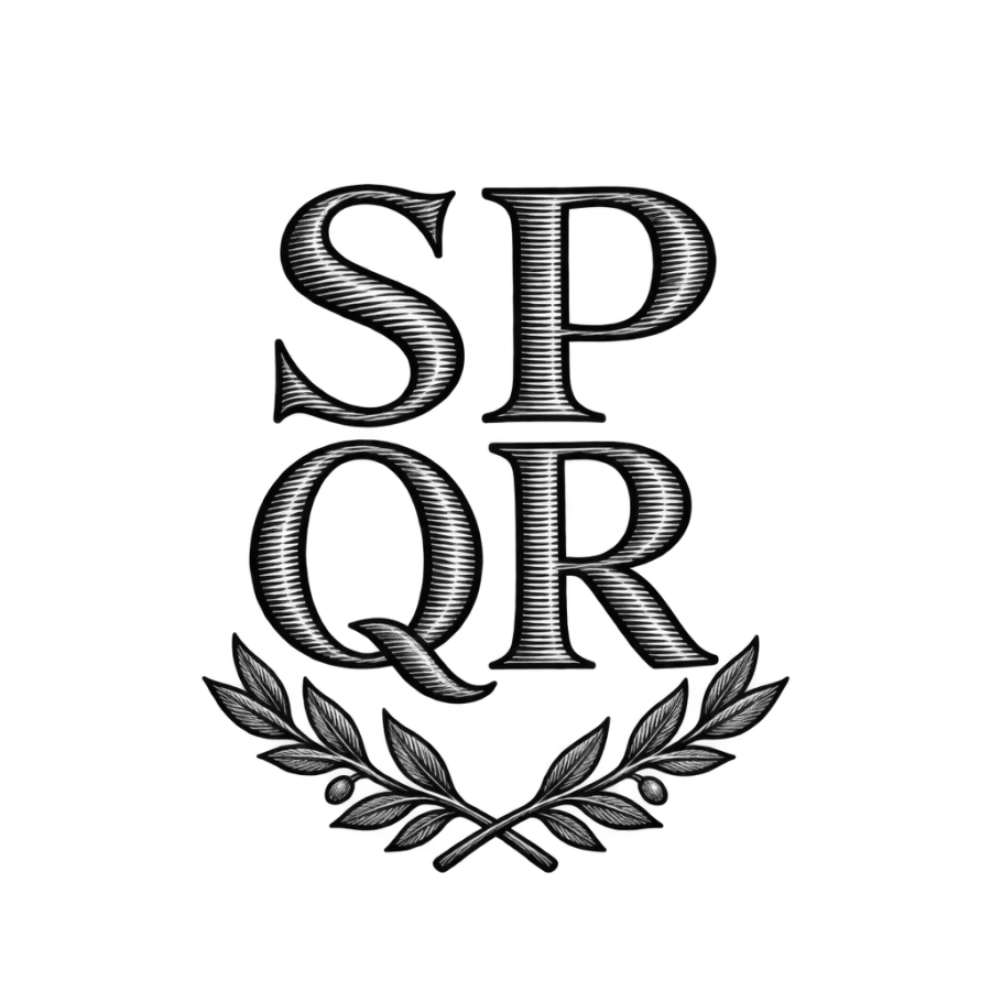
The letters SPQR stacked above a crossed laurel sprig, engraved serifs
Use this promptDescribe an idea of your own and get four designs back in about 20 seconds.
Open the generator
Questions people ask
What font is best for a tattoo?
For anything under 5 cm, roman capitals or a plain typewriter face, because their shapes stay open as ink spreads. For names and phrases at 10 cm and up, blackletter and sailor script both hold well. Thin modern scripts are the risky choice at small sizes, since the joins fill in first.
How small can tattoo lettering be?
Capitals need about 6 mm of height and lowercase about 8 mm of body height to stay readable for decades, with no stroke thinner than roughly 0.8 mm. A thin script needs about 3 cm of overall height. Below that the loops close and the word turns into a dark shape.
Do tattoo letters get thicker over time?
Yes. Ink migrates sideways in the dermis for the life of the tattoo, so every stroke widens and every gap narrows. Artists compensate by drawing wider letter spacing and keeping the enclosed spaces inside letters like e and a larger than they would be on paper.
Where do lettering tattoos age worst?
Fingers and the sides of the hands, where skin turns over fast and takes constant friction and sun, so touch ups are often needed within two to five years. Ribs and the stomach stretch with weight change and distort long lines. Forearm, inner bicep and upper back hold type well.
How do I check a tattoo in another language?
Have two native speakers confirm the wording and the script before you book, and give them the exact characters rather than a description. Machine translation misses tone and grammar. Read the stencil aloud on your skin with someone else there, and photograph it so you can check it the right way round.